
.png?width=300&name=key%20ingredients%20of%20playables_blog%20header%20(1).png)
Every fall, there’s one flavor that takes over menus, memes, and Instagram feeds: pumpkin spice.
When Starbucks first launched the Pumpkin Spice Latte in 2003, it sparked a seasonal tradition that’s lasted decades. What started as a limited-time flavor has become a cultural shorthand for fall itself. Love it or hate it, the PSL works because of balance. That is: espresso as the base, milk and foam for structure, and that signature pumpkin spice topping that ties it all together.
Playables — interactive ads that invite users to tap, swipe, drag, or play — are no different. Just like a latte, they rely on the right blend of “ingredients.” Too much of one, or not enough of another, and the whole experience falls flat. But get the recipe right, and you create something irresistible.
In this blog, we’ll break down the key ingredients of playables and show how they come together through three food-themed examples.
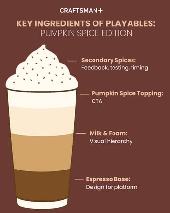
Ingredient #1: Design for Platform (Espresso Base)
Espresso is the foundation of every Pumpkin Spice Latte. Without it, you don’t have a latte at all. For playables, the foundation is platform design.
A playable that looks slick on desktop but breaks on mobile? That’s like ordering a PSL and getting a watery cup of cinnamon milk. Platform-conscious design ensures that no matter the device, the experience holds up.
Swipe to play!
Take this Coffee Shop Slicer playable. It turns the classic fall drink into a fast-paced mini game where users slice flying ingredients — coffee beans, whipped cream canisters, cinnamon sticks, pumpkin spice, and milk — before they hit the ground. Each slice adds to the “recipe,” building anticipation until the final blend is complete.
What makes this example shine is how fluidly it adapts to different screens. On mobile, ingredients cascade vertically, inviting thumb-friendly swipes that feel natural in portrait mode. On tablets, the space expands horizontally, with wider arcs and larger hit areas that keep gameplay satisfying.
By designing for platform from the start — optimizing layout, pacing, and touch zones — the ad feels as smooth as the drink it celebrates.
Takeaway: Espresso is non-negotiable in a PSL, and platform design is non-negotiable in a playable. Build for portrait, landscape, mobile, and tablet so your ad feels like a seamless part of the user’s journey.
Ingredient #2: Visual Hierarchy (Milk & Foam)
Milk and foam give a latte its texture, balance, and flow. Without them, you’re left with a harsh shot of espresso. In playables, that structure comes from visual hierarchy.
Visual hierarchy is the art of guiding the eye: deciding what users see first, what they notice next, and how they move through the experience. It’s built through scale, spacing, typography, and contrast. For instance, design guidelines recommend a 3:1 ratio for headers to body text, which is a simple but effective way to signal importance. Whitespace, color alignment, and consistent branding also play critical roles.
Drag to play!
This Starbucks Driving Game offers a masterclass in hierarchy. In this playable, users steer a car, switching lanes to reach Starbucks before time runs out. Every design choice leads the player’s focus:
- The roadway is centered, anchoring attention on the primary action.
- A pulsating “Order Now” button sits persistently at the bottom of the screen, ready for action without being intrusive.
- The Starbucks logo crowns the top, ensuring brand recognition even mid-game.
Hierarchy doesn’t just look good; it reduces cognitive load. Users don’t need to think about where to look because their eyes naturally flow from gameplay to brand to CTA.
Takeaway: Just as milk smooths espresso, hierarchy smooths interaction. Without it, playables feel cluttered and confusing. With it, they’re easy, intuitive, and memorable.
Ingredient #3: Optimized CTA (Pumpkin Spice Topping)
What makes a PSL iconic? The pumpkin spice topping. It’s the finishing note, the detail that lingers, the reason people come back. For playables, the equivalent is the call-to-action (CTA).
Even the most engaging interactive experience won’t drive ROI if users don’t know what to do next. A CTA should be bold, visually prioritized, and action-oriented. The “yes” button should be obvious; the “no” button should fade into the background.
Tap to play!
This Drink Menu Game demonstrates this beautifully. Styled like a café menu, it invites players to pick from options like Zen Ice, Frosted Bloom, or Citrus Ice. Once they make their choice, the real star emerges: a bright pink “Get the App” button.
The contrast is clear, the placement is strategic, and the action is unmissable. By optimizing the CTA, the playable ensures that the experience ends in conversion, not confusion.
Takeaway: The pumpkin spice topping is what makes people line up each fall. The CTA is what makes people click. Make it bold, make it clear, and make it irresistible.
Secondary Spices: Extra Flavors That Elevate
While espresso, milk, and spice are the core, the best baristas know the extras matter too. For playables, secondary ingredients can take a campaign from good to unforgettable:
- User Feedback Loop → Playables aren’t just ads; they’re data engines. Choices reveal what resonates with users. These insights can inform broader creative strategy.
- Testing & Iteration → Just as baristas tweak recipes, marketers should A/B test small variations: button colors, game speed, reward timing. The right tweaks can boost engagement significantly.
- Contextual Relevance → Pumpkin spice only works in the fall. Likewise, timing and cultural context amplify playable success, like syncing a food-themed ad with delivery promotions or seasonal menus.
These “spices” don’t work alone, but in the right measure, they deepen the flavor.
Your PSL Recipe for Playables
Just like a latte, a playable is all about balance:
- Espresso base = platform design. Adapt for device and screen.
- Milk & foam = visual hierarchy. Guide the eye with clarity and consistency.
- Pumpkin spice topping = CTA. Make the action unmissable.
- Secondary spices = feedback, testing, timing. Elevate the experience with smart extras.
Trends come and go, pumpkin spice may be seasonal, but the recipe for great playables is evergreen. Get the balance right, and you’ll not only capture attention, you’ll convert it.
Partner with CRAFTSMAN+
With years of experience blending design, data, and interactivity, CRAFTSMAN+ helps brands craft ads that perform and delight.
Ready to whip up your next high-performing playable?
Let’s brew something unforgettable together.