People love engaging with each other on the internet, and now, they can even engage with their favorite brands. Think of all the scrolling and commenting that is happening every second across all social media platforms. Users are continually bombarded with countless ads multiple times a second.
How do you stand out from the crowd? Playable ads.
Playables are a valuable tool for marketers looking to engage with their target audience in a unique and entertaining way. Whether it's a puzzle minigame, a choose-your-own-adventure style experience, or a user-generated content-based concept, playables offer a number of benefits for marketers.
But, with so many possibilities, it can be difficult to know where to start. That's why we've put together this expert guide to help you create the perfect playable.
1. Know What Motivates Your Audience
The first step in creating a successful playable is understanding what motivates your target audience. Playables are an opportunity to showcase standard gameplay or replicate an in-app experience. To make a lasting impact, focus on concepts that drive user engagement and create joyful moments.
Are your users looking for a challenge? To discover something new? Your playable should be built around these key motivators to ensure it resonates with your audience and drives engagement.
Here are a few common motivators to jumpstart your brainstorming:
|
Imagine searching for the perfect birthday gift for your best friend. You know them well, so you’ll choose something they’ll love. Or maybe you choose something that’s an inside joke between you too. Your audience deserves that same attention. Create a personalized playable you know they’ll enjoy.
For example, let’s say your app schedules tours for travelers. Your audience probably loves taking trips to new places. So a ‘Choose Your Own Adventure’ playable will tap into that excitement they’re looking for.
2. Understand Your Environment and Competition
Once you have a grasp on what motivates your audience, it's important to understand the competitive landscape and what kinds of concepts are resonating with your target audience.
The truth is other businesses are trying to solve the same problem you are. So get to know them. Look at what they’re doing and what’s trending in your industry. A thorough competitive analysis and creative trend forecasting is a best practice that can inform your next concept.
Here are some questions to consider about your competitors:
- What kind of ads do they put out?
- Which ads are their highest-performing and lowest-performing?
- What do their user reviews say?
- What are people commenting and posting about their app on social media?
- Are they trying anything fresh and different?
Additionally, your playable's success will be determined by the first two seconds of delivery, so it's crucial that your first scene draws attention and motivates users to interact. Keep in mind that the simpler the playable, the better the chances of maintaining engagement.
3. Skip the Fluff
Just get to it–Your playable’s success is determined by the first 2 seconds. Remember, users are scrolling quickly, so you have to grab their attention right away. It’s crucial that your first scene draws attention and motivates users to interact. Keep in mind that the simpler the playable, the better the chances of maintaining engagement.
Try these tips for a scroll-stopping playable:
- Avoid lengthy tutorials
- Use emotion; What do users want to feel? Inspired? Adventurous? Cared for?
- Use concise copy for an easy read
- Keep the vocabulary light and tone personable
- Make it intuitive so users can self-guide from start to finish
4. Test And Learn… And Test Again
The best way to create a successful playable is to test multiple concepts and variants. See what resonates with your audience and what they want more of.
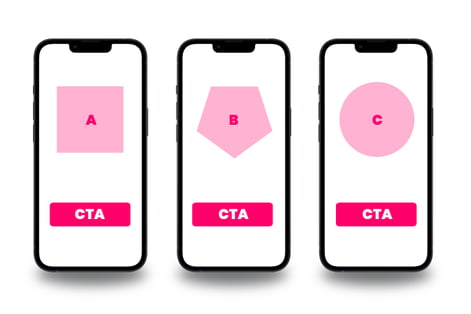
Creating A/B tests of each concept is a straightforward way to understand what's resonating with your audience and will help you refine your playable over time. Even small changes like switching the color scheme or CTA can make the difference between downloading or exiting. This will give you insight into what your audience is drawn to.

Each concept should target your audience’s interests, but have a different approach.
When concepting think of 3 variations that:
- Play it safe
- Give your audience exactly what you think they want
- Is totally out there and different from what you usually do
Then use what you learn from testing to make adjustments…and try again! If your playable doesn’t perform how you want, you’ll know what not to do—bringing you one step closer to creating content your audience actually wants. When your ad performs well, keep testing variations of that concept to find your winning playable.
Remember, it may take several attempts to find your winning playable, so be prepared to optimize and iterate as you learn.
5. Tell Them Who You Are and Make the Ask
It's important to maintain brand awareness and offer a persistent call to action (CTA) throughout the playable experience.
It might sound obvious, but make sure you have your business name on your playable!
Too many times, brands forget to include their logos. By the end of the playable, users aren’t sure who the ad is for. You want users to get excited about your business and tell their friends. So let them know who you are at every touch point.
| 💡 Quick tip: Keep your logo visible during each scene. You want to stay on top of the user’s mind! |
Once users start interacting with the playable, make the ask. If you want them to download your app, ask them!
You can do this by adding a clear Call-to-Action (CTA) to each scene, so it’s easy for users to take the next step. Make the CTA clear and direct–Something as simple as “DOWNLOAD NOW” tells the user exactly what they need to do.
Including a CTA on each scene can also give users the option to skip straight to the app store if they wish, while reassuring them that interacting with the ad won't immediately lead to the app store opening (a frustrating experience for users).
6. Deliver Seamless, Simple Mobile Experiences
You never know what device and angle your audience will see your playable from. You want your user experience to be seamless. So, act like a user and look at your playable on different devices and from different angles.
Ask yourself:
- How do assets format across all devices and orientations?
- What happens when I flip the device?
- Does the design resize to fit landscape and portrait?
| 💡 Quick tip: To create full-screen assets that fill the entire screen, center the content around a square as the central focal point, allowing for both portrait and landscape orientation. |
Make it Easy
Next, make sure users know they can interact with your playable. You don’t want them to mistake them for videos! Consider using pointers, animations, or text to guide the user.
- Pointers - Guide the user to interact with a pointer finger or arrow
- Animations - Make a button feel like a button by adding an animation
- Text - Add Simple text to guide the user
You can also extend the hit areas to make interaction more user-friendly. Aim for large hit areas that are larger than the buttons. This will prevent frustration and increase user engagement.
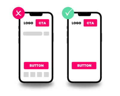
| 💡 Quick tip: Remember to keep the ad clean and remove any clutter or irrelevant elements that might distract from your key message. |

7. Finish Strong and Make the Ask Again
After users go through your playable, transition them to an End Card. Designing a strong End Card is crucial to drive user acquisition after the playable experience. Remind them who you are and what the CTA is. The purpose of this last scene is to direct users to the next step–downloading your app, making a purchase, or whatever it is you want them to do–so make it clear!
Consider these elements for a strong End Card:
- A prominent logo
- An extra large CTA button
- A full-screen hit area so users can’t miss it
- Motivating text or enticing animations to drive the message home
Creating a successful playable ad requires a combination of understanding your audience, testing different concepts, and delivering a seamless mobile-first design experience. Whether you're aiming to drive user engagement, increase brand awareness, or drive user acquisition, the tips outlined in this guide will help you achieve your goals.
So, what are you waiting for? Let’s get creative.
Interested in how CRAFTSMAN+ can help you put these tips into action and start building winning playable ads? With CRAFTSMAN Studio you can personalize your playables using ready-made templates or create your own with intuitively designed custom tools. No coding required! Request a demo today.

